
The challenge we faced
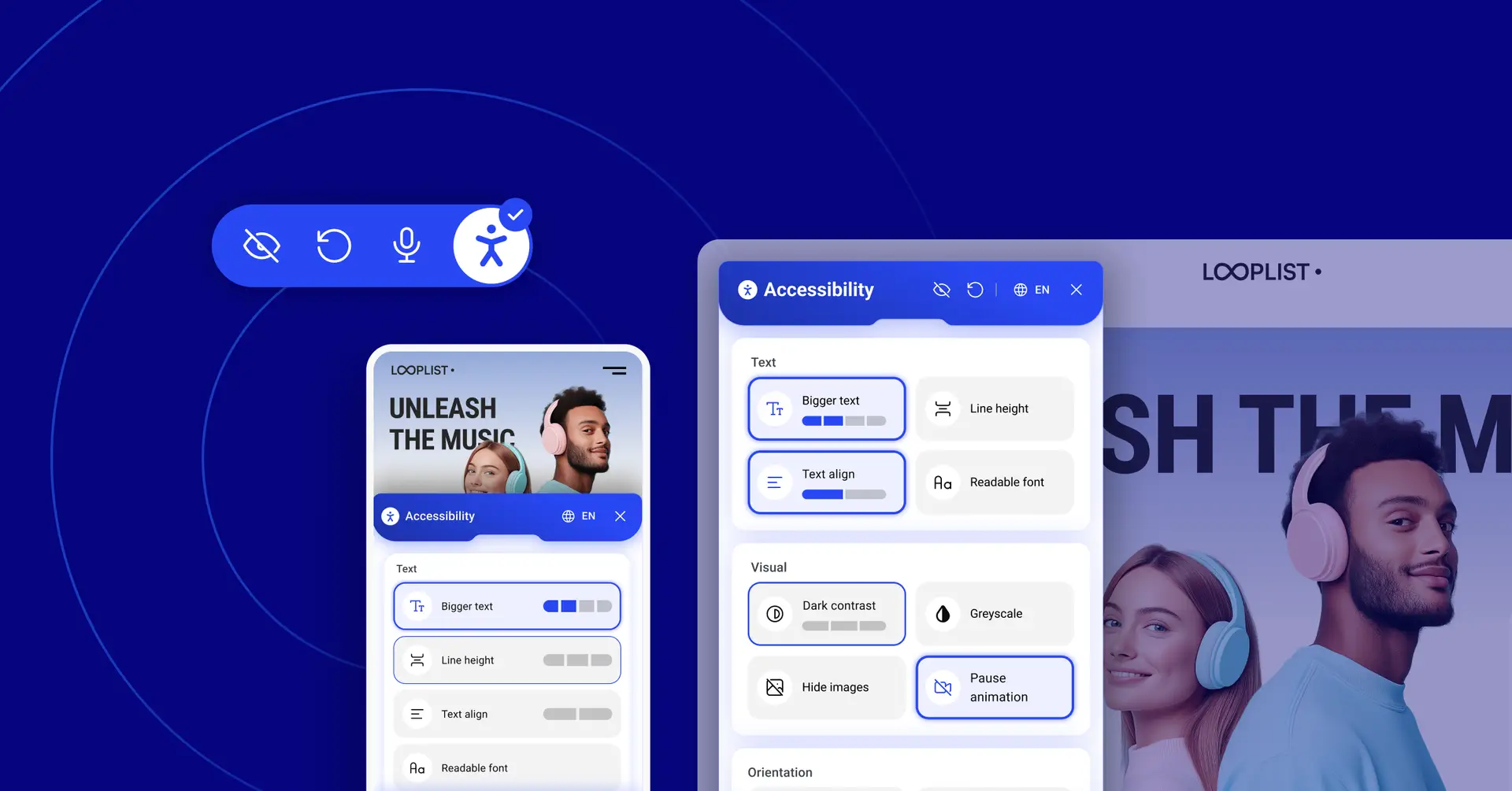
I recently joined Elementor as a Senior Product Designer to lead and shape a new line of WordPress plugins aimed at empowering our community of web creators. One of my first challenges was to take a fresh look at Ally, our accessibility tool, and rethink its widget experience, which already powers hundreds of thousands of websites.
Redesigning a successful product is always risky, so we had to ask a hard question:
Were we just making something that looked better and sold better, or could we create real value for the people who truly rely on it?
This is the story of how we challenged the status quo of “market-ready accessibility” and set out to design a widget that serves people, not just compliance checklists.
The problem we they saw
One of the mantras of user experience is that “you are not the user”. While most of Elementor’s products are designed for professional web creators, Ally’s accessibility widget was different. This time, we were designing for the visitors of our users’ websites, and specifically for those with disabilities who rely on accessible tools to navigate the web.
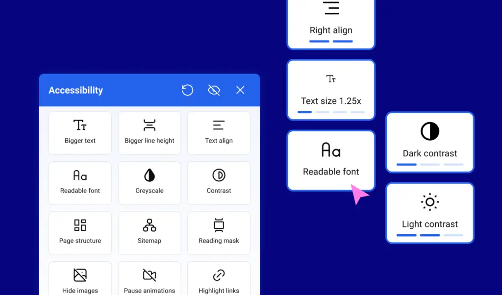
One of my first steps was to interview people with diverse accessibility needs and gather their feedback on the existing widget experience. Four big issues quickly surfaced:
- Hard to navigate: the structure was unclear, making it difficult to find the right feature.
- Unpredictable behavior: buttons looked the same but acted differently, from toggles to multi-step actions.
- Creator-first, not user-first: the widget was optimized for web creators rather than people using assistive technologies.
- Outdated look and feel: inconsistent with our brand and not inspiring trust.
Our goal was not to build just another widget. We wanted a solution that gave users clarity, dignity, and control.
What competitors taught us
As part of our research, we studied many popular accessibility widgets and found a couple of helpful patterns:
- Grouping features into categories makes them easier to scan.
- Visual previews show what a setting will do before applying it.
But there was one common personalization approach that did not sit right: some widgets suggested presets based on disability type.
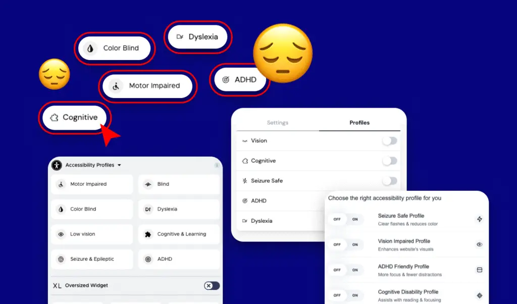
On the surface, this may sound helpful: “Tell us your impairment, and we will configure things for you.”
But in accessibility forums, people often described this as invasive and reductive. Instead of feeling supported, they felt labeled, and many worried about how their personal data might be stored or shared.
Trust, once lost, is hard to rebuild.
Listening first
To ground our work, we interviewed:
- Elementor web creators
- Accessibility experts
- And most importantly, users with disabilities
Some of the feedback that shaped our design:
- “I didn’t know ‘Bigger Text’ has four levels. I want to see that before clicking.”
- “Talking to the widget would be amazing, just say ‘increase font size.’”
- “Button size is critical, targeting something small is really hard.”
- “On mobile, don’t block the whole screen. I want to see the page while customizing.”
Every insight translated into a principle we carried forward.
Two prototypes, one direction
We explored two main UI directions:
Option 1: Large, full-width buttons
- Easier for motor and cognitive impairments
- Minimal distractions
- Works well on mobile where screen space is limited
Option 2: Compact, two-per-row layout
- Reduces scrolling on desktop
- Shows more options at once
- On hover or focus, previews the effect of each setting to balance clarity and cognitive load
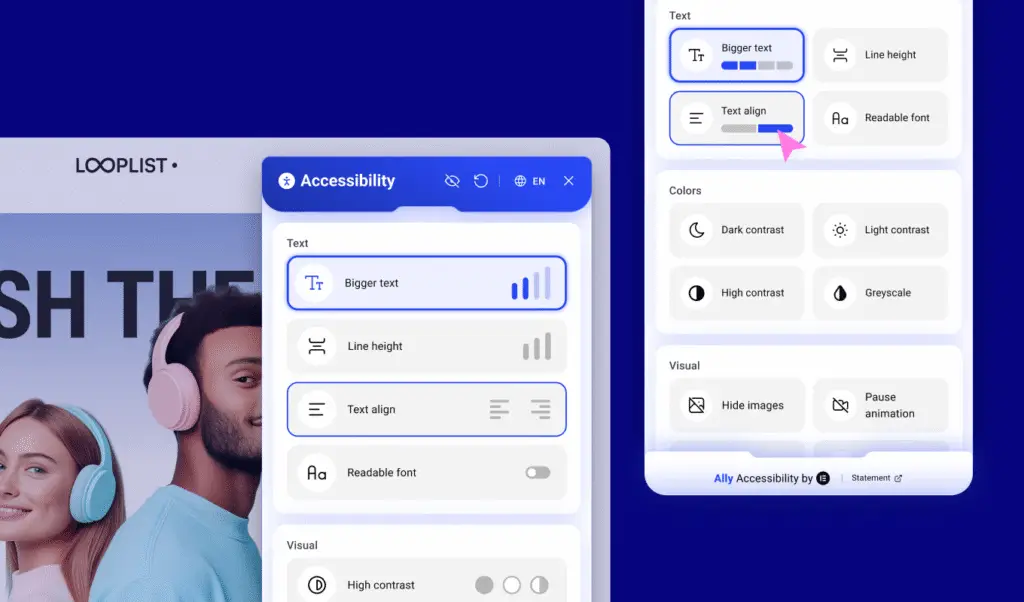
Our solution combined the strengths of both: Option 1 for mobile, Option 2 for desktop.
Accessibility is not one-size-fits-all. It depends on context.
A more respectful approach
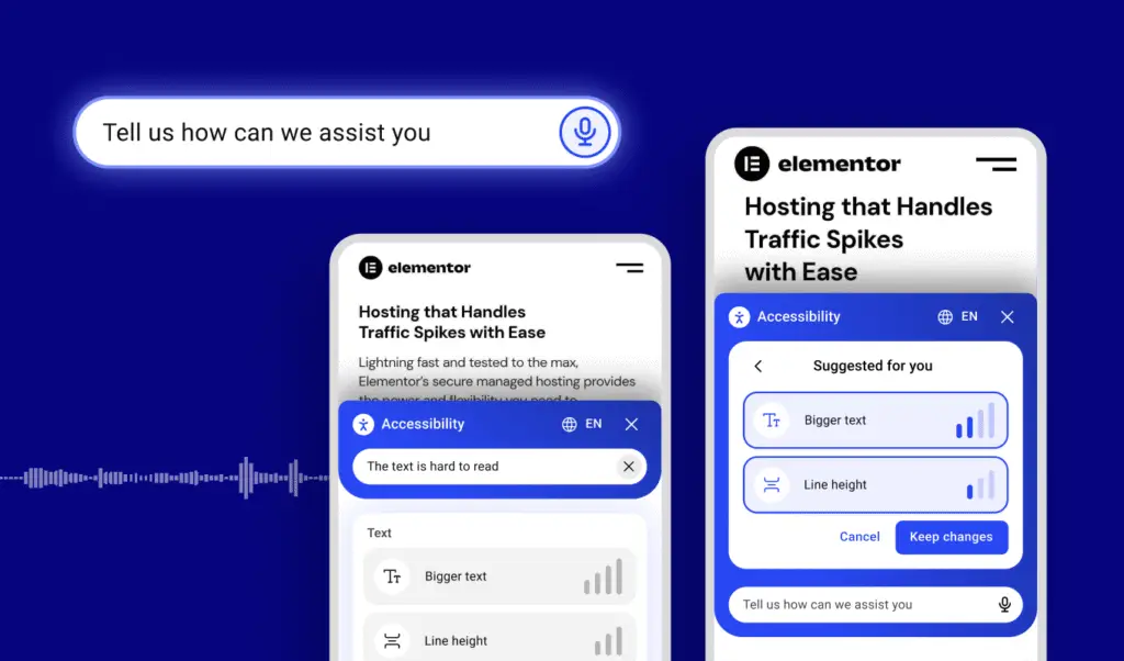
One of the most exciting ideas that came up during our work was voice interaction.
Instead of asking users to select a disability category, we thought to simply ask:
“Tell us how we can assist you.”
People can then type or speak naturally, and based on their input, Ally will suggest adjustments such as increasing text size or enabling a more readable font, which users can accept, tweak, or ignore the suggestions entirely.
This approach proved more respectful, more empowering, and ultimately, more accessible.
We are still looking into it, so stay tuned.
What’s Next
The new design is rolling out soon, but this is only the beginning.
For us, accessibility is not about ticking a compliance box. It is about building tools that respect, empower, and listen to the people who use them every day.
We will continue collecting feedback from both site visitors and web creators, and Ally will keep evolving, not just as a product but as a statement of values.
Because at Elementor, we do not just design for users.
We design with them in mind.
