
The challenge of designing for LLMs
Designing for Large Language Models (LLMs) isn’t just about creating an interface. It’s about shaping how people think, feel, and act in a conversation with a machine.
Unlike traditional software, LLMs don’t follow a rigid script. They respond in nuanced, sometimes unpredictable ways. That’s both their power and their design challenge.
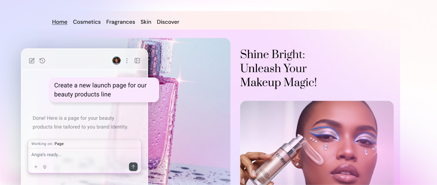
At Elementor, I’ve been shaping Angie, an agentic AI assistant for WordPress and Elementor. The goal: make Angie feel like a thoughtful, intuitive partner rather than a distant or mechanical system. Angie helps web creators, designers, and site owners generate content, solve design challenges, and make smarter decisions—all inside their site-building workflows.
Designing for LLMs demands empathy: protecting user intent, guiding them through uncertainty, and making the experience feel as natural as working with a trusted collaborator.
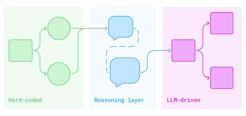
Designing the brain before the body
Angie didn’t start with colors, icons, or typography. It began with logic.
Before creating an interface, there were diagrams: branching flows and conditional logic mapping how the assistant should respond in different situations—When to ask for more context; when to provide a hard-coded answer; when to let the LLM lead. Each box and arrow signified a decision that would eventually shape how Angie thinks.
This initial work wasn’t visual design. It was behavioral architecture. The goal was to build a “brain” that could understand human language without losing direction. These flows became the invisible core of the assistant.
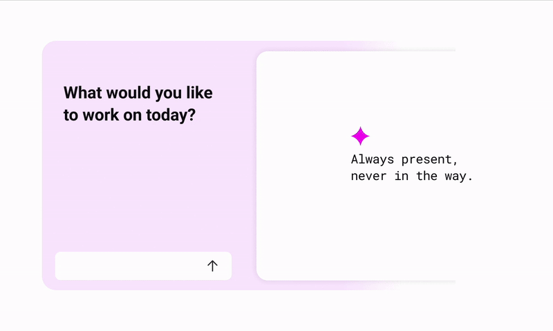
Where the assistant lives
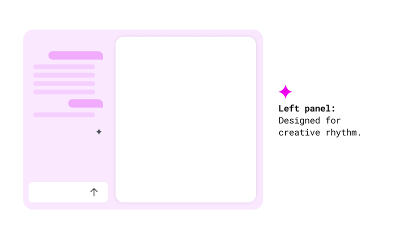
Angie appears in a persistent left-hand panel. Always accessible, never intrusive.
This was more than just a layout choice. It was about rhythm: prompt on the left, results on the right. Input followed by immediate feedback. It mirrors how creators naturally think and work.
The panel can be opened or closed at will. It never forces itself into the workflow. It waits to be invited. That sense of quiet readiness became a central part of the experience.
Supporting uncertainty and forward flow
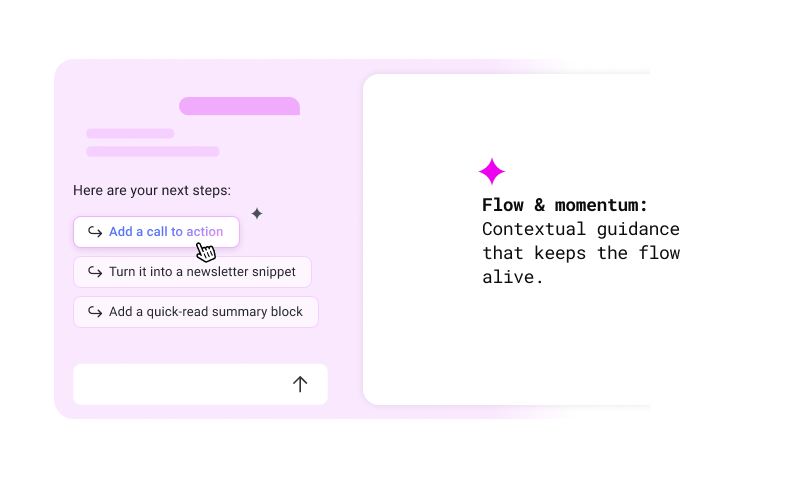
Users don’t always know what to write. That uncertainty is part of the creative process.
That’s why Angie provides suggestions after every result. They’re not decorative—they’re scaffolding that keeps creative rhythm alive. Each suggestion nudges the user forward.
The same principle applies to structural edits. When a user adds a new element to the canvas, Angie immediately offers context-aware options based on that widget—surfacing the most relevant next steps without requiring the user to search or ask. It’s proactive design, not reactive support.
This balance—knowing when to guide and when to wait—came directly from early architectural decisions. A mix of hard-coded behaviors and LLM-generated responses powers Angie’s ability to interpret vague input, clarify intent, and propose the next move. When intent is unclear, the assistant asks. When a task is complete, it opens the next door.
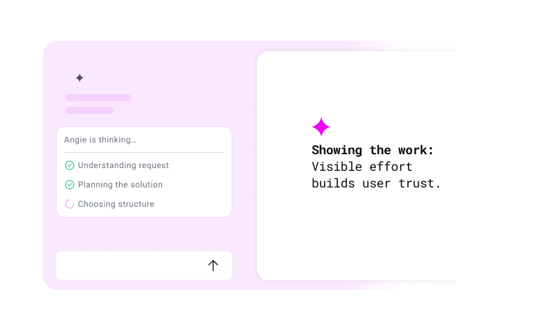
Showing how AI thinks
One of the most important design decisions was to show how Angie thinks, without overwhelming the user.
When the assistant is working on something simple, a light indicator appears: “thinking…”
For more complex tasks, or those that may take a few seconds, a transparent modal summarizes what’s happening in plain language.
This wasn’t just for show. It was a direct response to early feedback: users wanted confidence that their prompt was understood and being handled.
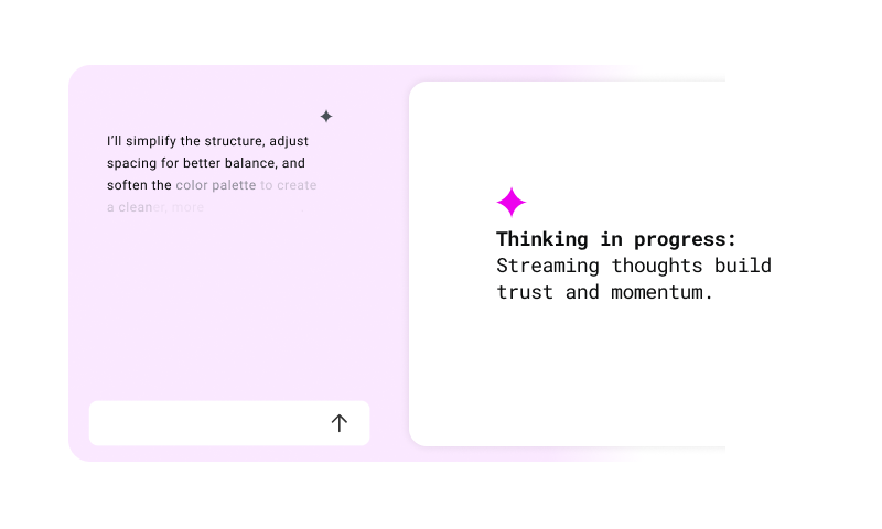
Revealing the progress in motion
Revealing partial results is a subtle yet powerful method for building responsiveness and trust in AI systems. When users see progress unfold in real time, waiting becomes part of the interaction rather than a pause from it. This technique, seen in systems like streaming text or live previews, reduces cognitive friction and shortens perceived latency.
That’s why Angie streams responses word by word. Instead of waiting until everything is ready, results appear immediately. Users can start reading, thinking, and reacting right away. It transforms idle waiting into active participation and gives the assistant a conversational rhythm that feels responsive and present.
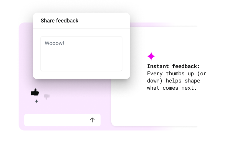
Designing feedback loops
Feedback isn’t just a rating. It’s a way to tune the system in real time. The most effective feedback mechanisms are lightweight and timely, surfacing when the user is still engaged.
Angie collects feedback through simple thumbs up/down actions. If a user gives a negative rating, a short follow-up appears with quick-select options and space for additional input.
This flow captures useful signals without breaking the user’s creative rhythm.
Creating a quiet presence
Most AI tools today are loud: gradients, sparkles, floating buttons. They scream “Look at me.”
With Angie, we made a different choice. The assistant had to feel native to existing platforms like WordPress and Elementor—not a novelty, but part of the creator’s existing toolkit.
That meant a quiet design: mostly black and white, with minimal color. No distractions. No gimmicks. The interface blends seamlessly into the editor environment.
And yet, there are small moments of magic. On hover, colors shift. Subtle glow effects appear. These micro-interactions are intentional cues that reveal intelligence without insisting on it.
The goal was simple: don’t distract. Belong.
Final thoughts
Designing Angie was never just about menus, clicks, or polishing the interface. It was about building trust—creating a design that emphasizes clarity and responsiveness, making the assistant feel less like a tool and more like a creative partner.
The true measure of success is when users trust the AI enough to challenge it. That’s the moment when a creator pauses and thinks: “This feels like collaborating with someone, not using something.”
At Elementor, that’s what we’re striving for: AI that amplifies creativity rather than replacing it, designed with empathy, and built to feel like a partner in the creative process.
