
Every journey needs a map 🧭
Building a website without a plan is kind of like driving a car without GPS — you can do it, but you’re not really in control.
If you’re like me, someone who can get lost in a parking lot, trust me, having a clear path makes all the difference.
That’s exactly what led us to build Elementor’s Site Planner: a guided, AI-powered tool that helps creators lay out the blueprint of their website before moving into design.
When I first joined Elementor, the company had just launched this brand-new product. The idea was simple but powerful: give web creators a clear starting point, so they wouldn’t have to jump straight into the advanced Editor from scratch or rely on a generic template.
Learn more about how the Site Planner was built from the ground up here.
Listening to users from day one 🤝
From the very beginning, the Site Planner was tied to a real-time feedback loop. Every user could rate their experience and leave a quick comment, which instantly appeared in a dedicated Slack channel open to the entire team.
This gave us immediate visibility into what was working, what felt confusing, and where the product fell short.
What we heard 🎧
From the start, users embraced the Site Planner with high ratings and plenty of positive feedback. At the same time, their comments surfaced clear gaps.
One theme stood out clearly: creators wanted their sites to feel styled and branded much earlier in the process.
As one user put it:
“Nice helicopter view, but I need to see style.”
Another highlighted the importance of branding and relationship with the client:
“Branding is very important, and I’m missing the ability to include the client’s logo… I wish the wireframes allowed for some content editing to help the customer see the vision.”
And a third summed it up simply:
“I like the wireframes and generated content. It’s not perfect, but with the options to add style elements it would be perfect.”
Turning feedback into focus 🎯
That feedback shaped our next mission: to introduce Styles into the Site Planner, so creators could feel their brand identity from the very first step.
For professionals working with clients, this meant showcasing drafts that already carried the client’s brand, making collaboration smoother and approvals faster. For creators building their own sites, it meant seeing their personal vision reflected early on.
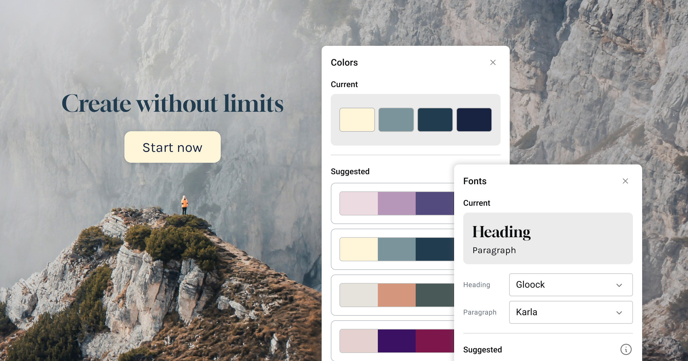
We translated this into three essentials:
- 🎨 Colors: global palettes mapped to Editor tokens, with AI-suggested palettes for exploration.
- 📓 Fonts: curated pairs tied to typography settings, with fresh suggestions to spark ideas.
- 🖼️ Logo: simple brand placement with strong impact.
Iterating fast and smart 🚀
We worked in rapid loops of define → design → test → refine, guided by three principles:
- Stay aligned with the Editor’s structure.
- Make customization intuitive and light.
- Use AI as an assistive layer, not a black box.
We experimented with animated previews, playful default styles, and different panel layouts. In the end, we prioritized clarity and continuity, ensuring everything created in the Planner would carry seamlessly into the Editor.
Balancing the needs 🏆
Designing Styles wasn’t just about adding colors or logos. It was about balancing two needs: helping beginners feel at home quickly, while earning the trust of experienced creators.
This balance is what we love most at Elementor: building tools that are simple yet powerful, and always empowering for creators.
Looking ahead ✨
At the end of the day, you’re the one behind the wheel.
AI is just the technology beside you, making the ride smoother, faster, and more confident.
Our real goal is simple: to deliver true value and control for web creators.
Styles is only the beginning.
