

Intro
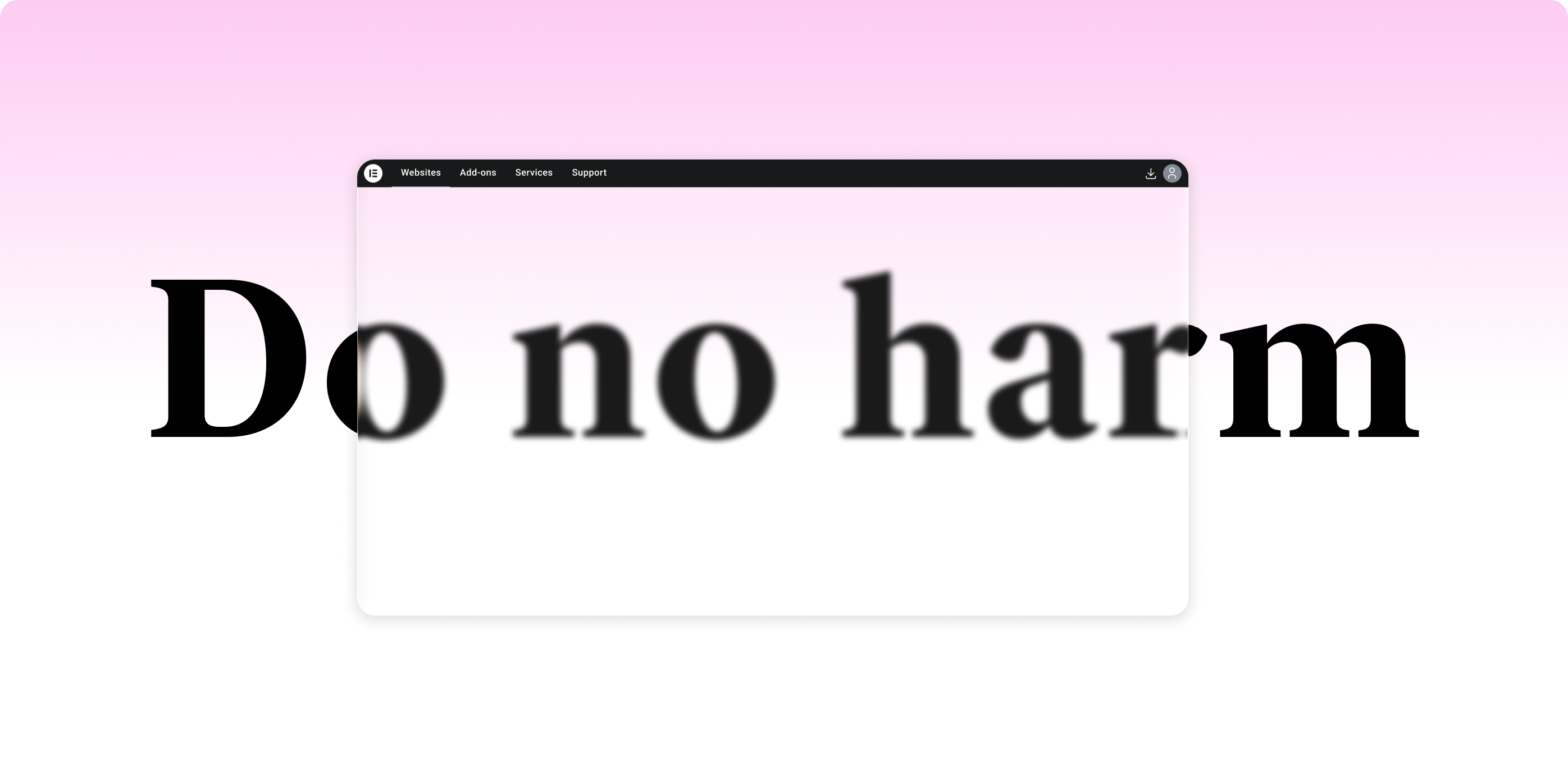
In late 2024, we redesigned one of the most critical and sensitive areas of Elementor’s platform: the dashboard navigation.
The challenge was clear. Create a structure that could scale with future products without hurting existing sales performance.
Here’s how thoughtful testing, real data, and a “do no harm” mindset turned a risky redesign into a solid foundation for the future.
Setting the Stage: A Dashboard That Grows With Our Users
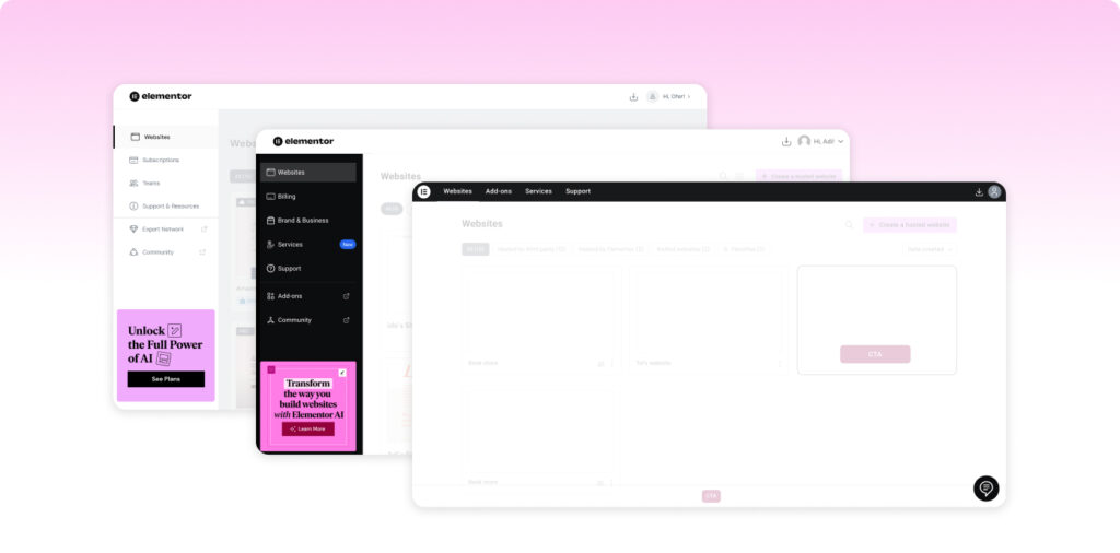
The Elementor Dashboard is the operational hub where users manage their relationship with Elementor.
Today, it’s primarily where they handle subscriptions, billing, and support. For hosting customers, it’s also where they manage key aspects of their websites. For many users, the dashboard remains their main touchpoint with Elementor outside the editor itself.
For us, it’s the digital home where product, design, marketing, and growth quietly intersect. A space that must feel trustworthy, clear, and efficient.
That balance is both powerful and delicate. Every design decision affects not only how confident users feel managing their plans, but also how the business performs. The banners you see in the dashboard drive real sales.
So before moving a button or changing a layout, we test, measure, and validate.
And this story, Chapter One, is about one of those redesigns: a new navigation system that redefined how users explore Elementor, how we measure success, and how we prepare for the company’s evolution from a single product into a multi-product platform.
Why We Changed the Navigation
By late 2024, our team took a long, honest look at the dashboard.
Over time, it had grown organically. New tabs, links, banners, and tools were layered on top of one another. As Elementor expanded with AI tools, hosting, marketing products, and maintenance apps, the old structure simply couldn’t scale.
We needed a framework that could:
- Support new product categories without overwhelming users
- Offer clear hierarchy and orientation for multi-site users
- And most importantly, protect conversions
Our mission was simple but strict: redesign the navigation to support growth without losing conversion power.
“Make it feel better. Work smarter. Sell the same or more.
Above all, do no harm.”
That phrase became our compass. Progress wasn’t about change for its own sake, but about creating value without breaking what already worked.
Designing Change Without Risk
The dashboard banners generate significant revenue through upsells and cross-sells, from subscription upgrades to new products.
We couldn’t afford blind risk.
Every design change had to be paired with real-time validation. We integrated Statsig, a robust A/B testing platform, alongside Google Analytics for cross-validation.
Our test design was simple and disciplined:
- Duration: one month
- Audience: randomly split between old and new navigation
- KPIs: click-through rates (CTR) and purchase conversions across banners and CTAs
This wasn’t just a redesign. It was a live experiment designed to answer one question:
Could better UX also mean better business?
The Test in Numbers
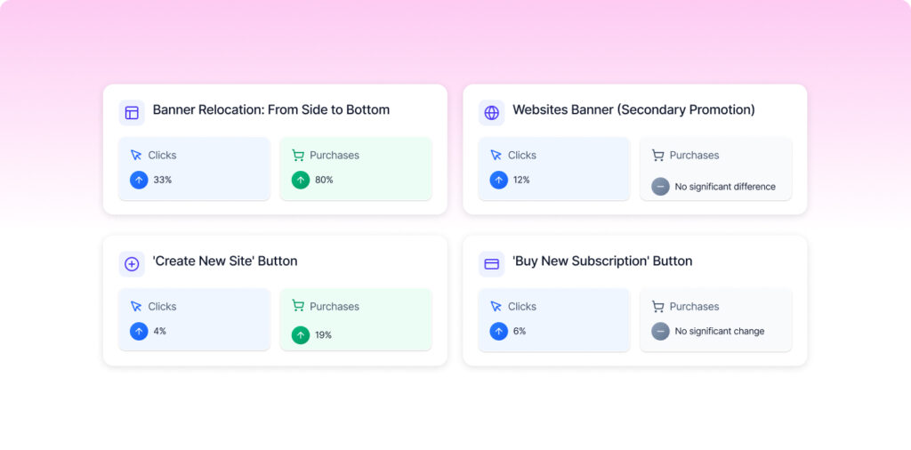
Banner Relocation: From Side to Bottom
We moved the main marketing banner from the sidebar to a bottom placement.
- Clicks: ↑ 33%
- Purchases: ↑ 80%
The new placement aligned with the natural reading flow. Users reached it at the right decision moment. It felt calmer, less intrusive, and surprisingly, more effective.
Sometimes doing less visual shouting earns you more attention.
Websites Banner (Secondary Promotion)
Inside the “Websites” tab, we tested another promotional banner.
- Clicks: ↑ 12%
- Purchases: no significant difference
Even without major purchase growth, curiosity increased. Engagement isn’t only about conversion, it’s also about momentum and discovery.
‘Create New Site’ Button
Our core activation CTA and one of the most telling metrics.
- Clicks: ↑ 4%
- Purchases: ↑ 19%
A small layout improvement created a meaningful lift in both action and confidence.
‘Buy New Subscription’ Button
- Clicks: ↑ 6%
- Purchases: no significant change
Not a headline result, but a steady improvement in discoverability.
More Visitors, More Curiosity
The new navigation did something unexpected. It inspired exploration.
The last three tabs saw a noticeable rise in visitors. As more users reached these pages, CTR percentages dipped slightly, but the absolute number of clicks increased.
The data told a quiet story: people were simply more curious.
From a UX perspective, that curiosity was gold. From a business perspective, it meant users were discovering value they had previously missed.
Rethinking Where Subscriptions Belong
Alongside the navigation redesign, we made another key change: moving the Subscriptions page into the user profile.
For years, subscriptions lived front and center, a logical choice when Elementor offered primarily one core product. But as our ecosystem expands, we want users’ first interaction to focus on what they can do, not what they pay for.
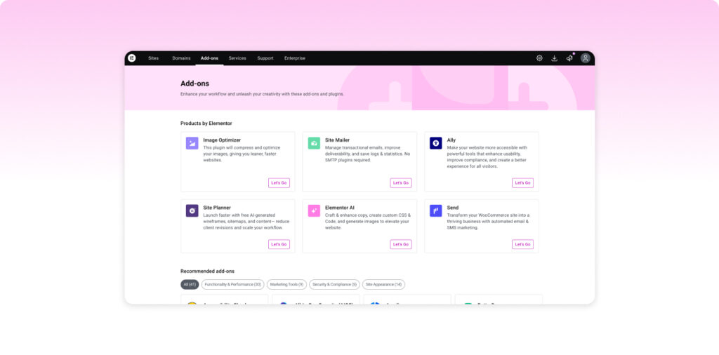
By shifting subscription management into the profile, we gave the dashboard back to the products themselves: Hosting, AI, Ally, Image Optimizer, and more.
This reinforced a subtle but important message:
Elementor is becoming a platform, not just a plan.
It’s a small move in pixels, but a big move in meaning.
The Power of Doing No Harm
Perhaps our favorite data point wasn’t quantitative at all. It was silence.
No tickets. No complaints. No “Where did my stuff go?” moments.
When we compared Statsig results with Analytics, the overlap was uncanny. Two systems, same conclusion.
The redesign worked safely and effectively.
The best redesigns are the ones users don’t need to ask about.
What Made It Work
Looking back, five principles kept us grounded:
- Evolution, not revolution: familiar mental models made the change feel like an upgrade, not a reboot
- Scalability by design: we designed for what comes next, not just what exists now
- Data before ego: every hypothesis had a metric, every decision had a test
- Human feedback loops: quantitative data paired with observation and behavioral insight
- Quiet confidence: reduced noise, balanced layouts, and calm colors built trust
From Navigation to Platform
This project is just the first act.
Elementor is evolving into a multi-product platform where creators can plan, build, launch, and manage everything in one place. The navigation redesign was the opening move, laying the groundwork for deeper integrations to come: AI tools, collaboration, credit management, performance insights, and more.
The Takeaway
As designers, we love dramatic makeovers. But sometimes, the real art lies in restraint.
This project reminded me that impact doesn’t always look loud.
The results speak for themselves:
- +33% banner clicks
- +80% banner purchases
- +19% new-site purchases
- 0 user complaints
- 1 scalable navigation system
Not bad for Chapter One.
To Be Continued…
The Elementor Platform Redesign has only just begun.
In the next chapter, we’ll explore how this foundation expands, connecting products and experiences into one cohesive ecosystem.
Because great design doesn’t end at launch.
It evolves, guided by data, empathy, and curiosity.
